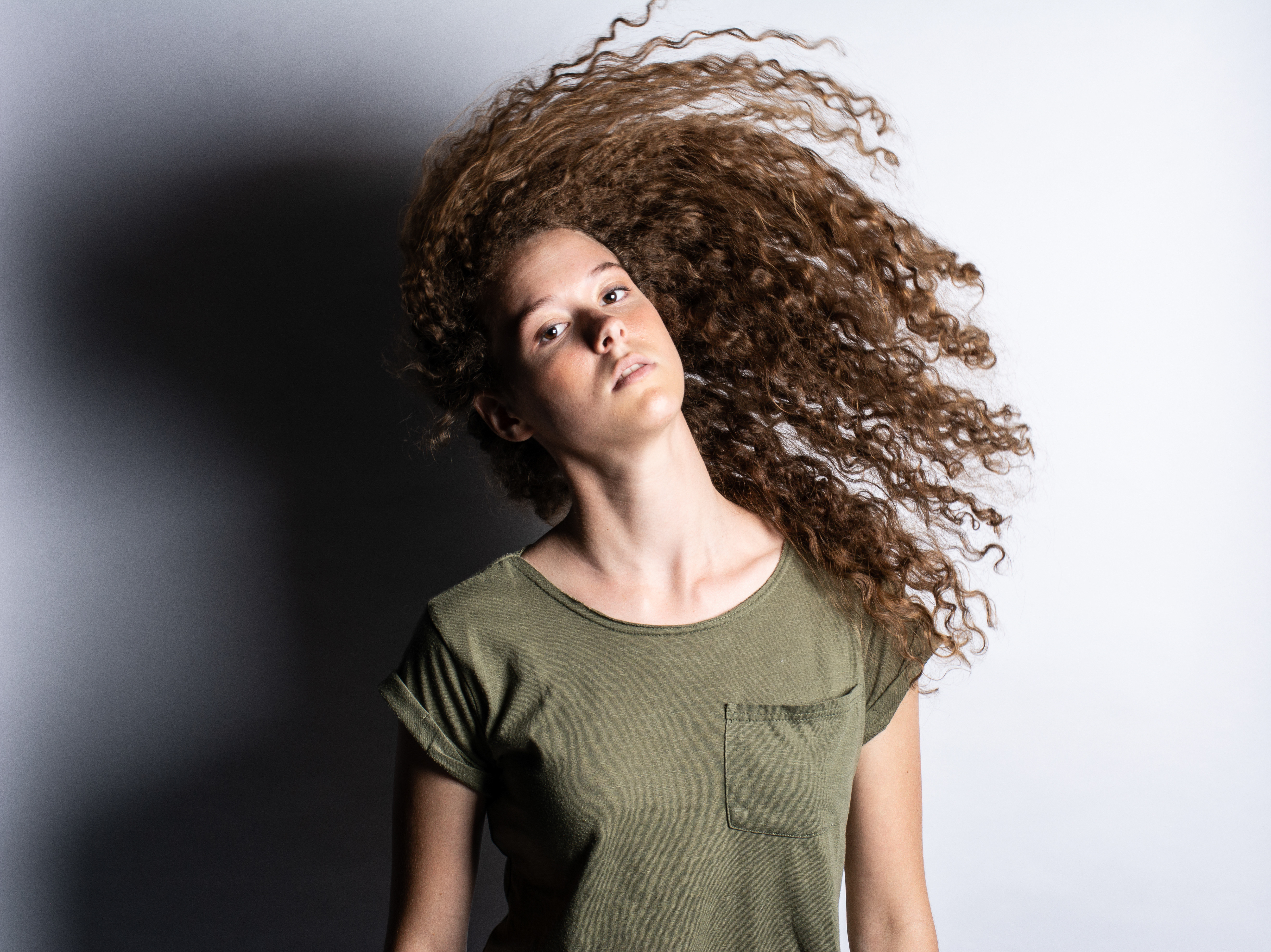
For these posters I tried to not only change the pictures of the layout but experiment with different layouts that still carry the same theme. Green was an obvious scheme choice because the company deals with food.
Experimented with the drop shadow effect here and throughout the other posters as well
Made sure to have one main 'hero' image in each poster
